When you’re looking to increase ticket sales, one of the first places you should look is your website.
Is the design current? Does it accurately reflect your particular brand? Can potential customers view and navigate the site easily? Is it optimized for mobile?
What does your site have that makes it stand out from other people doing the same thing?
Here at Vibethink, we’re no stranger to this concern.
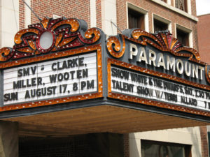
The Paramount Theater
 When Charlottesville’s Paramount Theater was looking for a new website, they identified their primary goals as increased ticket sales, increased donations and use of the theater as an event venue.
To meet their goals, we first studied the audiences of The Paramount’s website. Who visited the website? What were their exact goals in visiting the website? And, most important of all, what can we design to make it easier for them to achieve their goals?
Increasing Ticket Sales
We found that most visitors would have already heard about a specific show they wanted to see from exterior promotion such as Facebook posts/ads, posters around town, or the Paramount Marquee. Those users needed to be able to get to the list of events with minimal confusion and have an easy way to find the event they were looking for.
Based on the success of the Paramount’s brand, other users wouldn’t exactly know what they wanted, and would rather browse the events for something that caught their attention. These users would also need to be able to get to the list of events with minimal confusion, but they would need a clear view of all events to get an idea of their interest in them.
Once we detailed the audience motivations, we designed the journey we wanted each audience to take. How would different audiences ideally navigate the site? These user journeys allowed us to build out an optimal user experience that would bring together the needs of all of the different audiences.
Journey mapping quickly identified the need to concentrate redesign activities on the events pages. Improved searching and filtering functionality would improve the user experience significantly, allowing them to browse categories of events that they were most interested in during their preferred time frame. Simple preferences, such as an option to switch the view of events from a grid to a list, gave users the flexibility they needed to commit to a purchase.
Events list was not the only useful user experience improvement we made in their site that lead to increased ticket sales. We included a simplified navigation that created a clearer flow through the site, allowing the user to easily find the information or events they were seeking. Also, we redesigned their entire mobile experience to be clearer and more user-friendly, making finding tickets to a show from a phone significantly easier.
To minimize user confusion and streamline administrator workflow, events are removed from the live site automatically when they pass. We also added a homepage slideshow, allowing selected events to be featured so that a casual user would see them. Included is a link to buy tickets for each event, and a link to see all of the events. We also integrated with the Tessitura API to create a seamless ticket purchasing experience across all platforms.
Their site was designed to be sleek and modern, yet incorporate classic design elements of the fully restored Depression Era theater. The Paramount Theater was restored to its former glory to look like it did during its prime in the 1930’s. Yet they have seamlessly integrated modern technology into the theater itself, boasting cutting-edge viewing and sound systems alongside antique moldings. We brought this concept into the design, taking common modern design elements and integrating them into uniquely classical Paramount style.
Use of the theater as an Event Space
Another goal of The Paramount Theater was to improve visibility of different parts of the theater as an event space. So when we designed the page for event rental, we made sure that the space was showcased as clearly as possible. One of the most interesting features is a virtual tour of both of the spaces that the Paramount offers, powered by Google Maps Street View technology.
Increasing Donations
50% of The Paramount’s revenue comes from donations. When we designed and developed their site, we also made sure to seamlessly integrate a repeated call to action for donations. The call to action is bold enough to catch the user’s attention, but not distracting from the main content of the site despite being on every page at least once, as well as in the footer. We also made it easier for users to understand how the donation process works as well as their role in it.
Together with the team at The Paramount Theater, we created a site to meet their goals and surpass their expectations, bringing new life to The Paramount Theater once again.
The Virginia Film Festival
The Virginia Film Festival is a large scale annual festival celebrating film as an art form. When they came to us in 2014 asking for a new website, we were glad to oblige. After meeting with them, we established that their primary goals were to focus on the experience, have an immersive film guide, expand the message of the festival, and to increase ticket sales.
After the new site launched and the 2014 Virginia Film Festival completed, ticket sales had increased by an unprecedented 45% year over year, (after growing only 11% in previous years). Since then, the festival has continued to break their own ticket sales records regularly, though none of them as impressive a jump as that 2014 year.
What did we do to help increase ticket sales?
Through our design workshops, we confirmed that the primary audience of the Festival is a person who knows about the festival itself and likes certain actors or movie genres, but doesn’t necessarily know many of the specific movies. So we again focused on the Events section, but this time we designed a highly involved browsing and searching interface. We put in intricate filtering and searching, allowing users to discover screenings they want to see within the the film guide.
We also designed a distinct “Scheduling” section, allowing users to find what movies are their priority filtered by time, genre, and location.
Read more about The Virginia Film Festival project on our case study page!
These were combined with a streamlined ticket purchase experience, allowing users to make their purchases easily and intuitively. We also made sure these intricate experiences were well designed for a mobile experience as well so that visitors could search shows, view the schedule, and buy tickets from their smartphone.
At the end of the day, ticket sales and conversions are most of the Virginia Film Festival’s revenue. So we needed to make it as easy as possible for people to get to and buy the tickets. We ensured homepage design used the most prominent part of the home page to send the users to buying tickets.
Further Expansion
We have continued to work with The Virginia Film Festival since their groundbreaking site launch year. They commissioned us to create an “off season” website for them to use for educating visitors about their purpose and keeping regular attenders up to date on festival news. They also work with us to incorporate periodic updates to both sides of the site to maintain their cutting edge design.
We needed to make it as easy as possible for people to get to and buy the tickets.
Here at Vibethink, we are no stranger to helping clients improve ticket sales. Defining a customized digital platform for your business is the core goal of our process. We have both worked with existing systems such as Tessitura and created custom ticketing platforms from scratch. Together with your team, we can create a solution unique to your company or event that can increase your ticket sales and meet (or surpass) your other business goals.


