
Whitespace
You’re looking at the design for your website. The first thing that pops into your head is “what’s with all of that white space? It’s wasted space!”
But is it really?
Imagine that you get to a website and there is little to no whitespace. There is content and imagery absolutely everywhere. Your eyes dart around the page, trying to find a rhythm or a path through the content that will let you see everything easily. There isn’t one.
If you haven’t left the site at this point, you’re whipping your eyes back and forth trying to make sure that you don’t miss anything potentially important.
Frustrating, isn’t it?
Here’s an example of a site with an extreme need for whitespace: angren.net
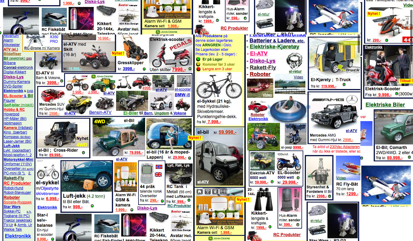
It’s confusing, it’s frustrating, and there is too much content on the page with no way to figure out where the different parts go.
This is why web designers insist on having at least some whitespace. It allows your content to breathe a bit, giving the user a more relaxed and intuitive experience.
There is a such thing as too much white space, these are websites that look empty. You should keep an eye out for this, though you’re much more likely to have the problem of too much crammed into a small space.
However, readability is much more than just the proper amount of whitespace.
It allows your content to breathe a bit, giving the user a more relaxed and intuitive experience.
Readability
Readability is how easy it is for the user to get the message you are trying to send. It is everything from the aforementioned whitespace to navigation to typeface to color scheme.
The entire point of a website is that you’re trying to get a message across. So why make it hard for the message to be read?
While a large portion of readability on your website comes in the design, there are things you, as the client, can do to help improve readability.
Readability Tips
Do not write paragraphs, or articles, that are too long. Internet readers are skimmers who tend to ignore large blocks of text beyond the first couple of sentences. I doubt you’re reading this whole paragraph beyond that first sentence and won’t even notice if I trail off into cats are one of the most antisocial animals ever.
Watch basic errors. Spelling and grammar mistakes upset the natural flow of your writing, which detracts from readability.
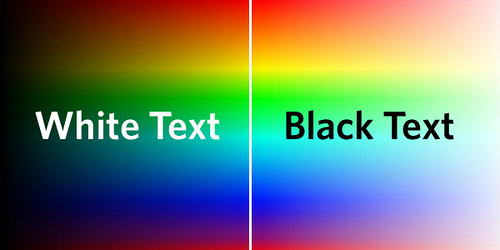
High contrast in color. Most of this is in the hands of your agency, but many content management systems, including WordPress, allow you to change the color of the text.
Under most situations, your best bet is going to be leaving the colors alone. If you want to change the color of the text for any reason, talk to your agency. They will have the best advice on whether this is going to enhance or decrease readability.
Short headlines and page titles. You want to be able to glance at a page title and get the general gist in a glance. This is harder for headlines and blog titles because they have to be readable and catchy. That balance is a bit harder to find.
Subheadings in your articles. Not only are they great for SEO, but subheadings break up the flow in a more natural way, creating a better user experience.
Read More
Don’t mess with text alignment. Again, in many cases this is handled by the agency, but if you have a content management system you may have the option to do so.
Your best option is to leave the text as it is. Talk to your agency if you really want to change text alignment on something.
Add images. Images can be everything from a piece of additional information you wish to get across, to a simple graphic that is related but provides guided, natural breaks in content.
Essentially, you’re writing for your audience. Writing readable content boosts your SEO and your visitor count because you’re making your content accessible. Internet users don’t want to have to think too much. The easier you make it for them, the better the traffic on your site will be.