I feel a little sheepish writing an entire post about a lowly button, but with the research that’s out there on the topic, I’m convinced the subject is worth paying attention to. What I’ve found is that very subtle differences in design and copy can make or break a call-to-action (CTA) button and dramatically influence conversion rates.
Before diving into what makes a successful call-to-action button, it’s worth noting its role in the conversion process. A person doesn’t do something because a button tells them to. Ultimately, conversions happen because a user has been persuaded by an effective sales pitch and the allure of a product. So, the purpose of the CTA button is not to be a conversion maker, but to provide a last little push that moves a user towards decisive action. It’s worth noting that if executed poorly, a CTA button can be a serious conversion killer. Creating a successful CTA button is like closing an electrical circuit with a switch; it’s about making sure that everyone who’s energized by your brand makes contact at a critical moment.
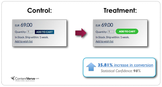
To bring home how small details can affect conversion rates, check out these user tests below from Unbounce. By changing the color and shape of the button, the designers increased conversion by 35 percent. Pretty amazing.
Click it, press it, or push it… it’s still a button
The most effective call-to-action buttons help the user quickly and clearly answer two questions– Where should I click? and Why should I click?–with such ease that she doesn’t hesitate. The user knows exactly where to click and she wants to click. This is a crucial distinction. The testing shows examples of buttons that are clear enough, but get out-performed when a color is changed or the copy is tweaked, which means that the user’s decision-making process is emotional and sensual, not merely utilitarian.
For a user to easily decipher where to click, the button needs to draw the eye by standing out from its surroundings or (do I have to say it?) it needs to “pop.” Making a button pop can be accomplished by manipulating its color, form, white space, size, etc., but whatever the method, it needs to make the user feel like it’s an interactive, clickable object.
Question: What do our eyes see as clickable objects?
Answer: Buttons.
Now I know, I’ve basically just told you to “make it pop” by reverting back to skeuomorphic design. Do I sound like your least favorite client? A friend who keeps recommending the same ‘90s bands? Well, hear me out.
In web design of late, we have scorned the skeuomorphic and triumphantly adopted flat design as a more honest approach for the digital framework. However, before we completely go over to the flat side, it’s important to remember why we embraced skeuomorphic in the first place; it was to give the user an analog reference for how to interact with a digital interface.
Recently, I’ve been seeing too many flat designs that muddle interactions by trying to reinvent the wheel, eschewing normal interaction cues like buttons. And if there is anywhere in a design where the user needs to know, without-a-doubt, how to interact with an element, it is in your call-to-action button. So even if you don’t give it a drop shadow, a subtle nod to the physical world that references the form and size of a button will do your design and, consequently, your conversions a big favor.
Simple rules for call-to-action design:
- reference the physical world: The more your CTA looks like a button, the more automatically the user will want to click it.
- size matters: The size of a button determines the visual emphasis and hierarchy of importance.
- prioritize positioning: Placement on the page influences when in the user’s decision-making process the button is seen.
- scheme your colors: By creating contrast in color, you can draw the user’s eye and help them feel more inclined to make a decision.
- give it some white space: By separating the button from other elements, you can help focus the user’s attention.
How to get your words working
Let’s say you’ve already drawn the user’s eye to the button, and it feels eminently clickable. In order to close the conversion, in the same instant, you need to convey why the user has to click your button. And this is where the tiniest differences in copy can make a huge difference. Buttons that do not clearly relay what to expect don’t do very well. Avoid vague words like, “Go,” “Submit,” “Enter.” Don’t be afraid to add a little extra explanatory text, even if it bulks up the button. It’s worth it.
Beyond the utilitarian objective of conveying what will happen when the button is clicked, you also want to create copy that compels the user to click. Creating a sense of urgency, placating fears, and pre-emptively answering questions are all ways that you can help give that last little push to a conversion.
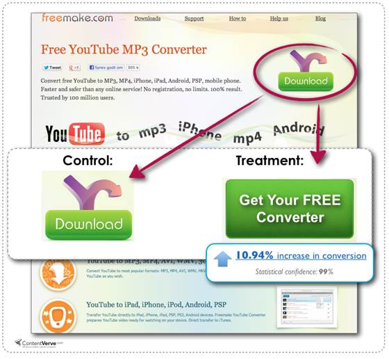
Check out these user tests from Unbounce where changing the language on the button made a big difference. The button got fat and less streamlined, but users knew what to expect when clicking, and so they did.
Simple rules for copy that clicks:
- get the message right: Make sure copy clearly indicates what a user can expect when clicking. Don’t say “submit” when you mean “start my free trial today.”
- create a sense of urgency: You want people to act impulsively, so it might make sense to remind them their opportunity could disappear.
- ease fears: Consider adding extra copy that addresses potential concerns, ie.– it’s easy, or it’s quick, or it’s free
- anticipate questions: Whenever possible, preemptively answer any questions the user might have.
- create attachment: By using personal pronouns, you can subconsciously create the feeling that the user is already involved. Clicking becomes a consummation of an already established relationship.
CTA Buttons & Conversions: Resources and Research
Really interesting research on conversion statistics that shows how conversions can be influenced by small design changes of CTA buttons and messaging.
http://unbounce.com/conversion-rate-optimization/design-call-to-action-buttons/
Very detailed look at all of the design and copy of a CTA button that can influence conversions.
http://www.smashingmagazine.com/2009/10/13/call-to-action-buttons-examples-and-best-practices/
Insight on design patterns, copywriting and conversion rates.
http://unbounce.com/conversion-rate-optimization/conversion-killing-tactics/
Covers the bases on what makes a good conversion CTA
http://onboardly.com/content-marketing/beyond-click-here-how-to-create-irresistible-calls-to-action/#.U0_zR-ZdW8t
Really nice overview of a lot of conversion tactics. Especially interesting checkout process tips.
http://www.copyblogger.com/call-to-action-buttons/


